Thursday, August 22, 2013
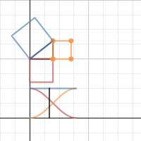
Desmos and the Pythagorean Theorem
I think Desmos is really doing great stuff. I like how clean this graph is and think it could make a great talking point in class.
Saturday, August 17, 2013
Adding Context to Scientific Notation
The world of the small is a great place to introduce scientific notation. This FEI gallery is fantastic and often includes the measurements in the photos: http://flic.kr/ps/DDQp3 I am going to use a bunch of these in my lessons. We could do a daily activity, asking "how many meters is that?"
Friday, August 16, 2013
Pay it Forward
I am a big fan of the movie Pay it Forward. Not only is the film a tearjerker, but I think "paying it forward" could unfold into a great math lesson.
Here is how "paying it forward" works:
1. Do something nice for three people
2. Don't ask them to pay you back, ask them to pay it forward and do something nice for 3 other people.
Students can always read the original story.
Here is how "paying it forward" works:
1. Do something nice for three people
2. Don't ask them to pay you back, ask them to pay it forward and do something nice for 3 other people.
 |
| Trevor explaining Pay it Forward to his class |
I am thinking of questions like "how long would this take to effect everyone on Earth?" Students can interpret the word "long" to represent both iteration and time.
I think its surprising that it would only take 21 iterations to reach the current population. Its also interesting to discuss how 3^20 is not nearly enough, but 3^21 is way more than enough to reach everyone everywhere.
We could go pretty far with our modeling around this problem, but I would my students take the lead. They need to ask questions like:
-can everyone pay it forward? (think babies, deaths, etc)
-not everyone would pay it forward, so how do we deal with that in our model?
I am thinking of starting by showing the trailer:
And at some point I want to show a visual of 3^x. I would use Desmos or Geogebra for the function, but I really want to find other ways to show the idea of exponential growth. This tree has up to 3^5 (or you can view it below).
Students can always read the original story.
Thursday, August 15, 2013
Bike share in math class
The bike share program is new here in New York, but I know its perfect for math class. Not only can we model cost based on time and distance, but New York is sharing all of its data in beautiful interactive charts. I could spend an entire lesson just talking about the story behind each graph. I love that you can toggle through all types of data:

More than that, you can download the raw numbers and play with them on the data software of your choice. The link to the raw data is on the bottom right of the screen:

Boston seems to have set up a competition at visualizing the data behind their bike share program.
With these two examples, I am wondering what else we can find.
More than that, you can download the raw numbers and play with them on the data software of your choice. The link to the raw data is on the bottom right of the screen:
Boston seems to have set up a competition at visualizing the data behind their bike share program.
With these two examples, I am wondering what else we can find.
Shaun and Brian Lehrer
I am a big fan of Brian Lehrer and was excited to get through today on his show on standardized testing and the common core standards. The episode is fascinating, but if you just want to hear my comments, I am on at about 12 minutes and 30 seconds in.
How Much Caffeine is in Your Cup?
I am a coffee snob and am always searching for the perfect cup. I don't often worry about the level of caffeine in my cup (I drink so many cups each day that caffeine no longer has much of an impact), but I came across this article and started to think, "there has got to be a lesson in this."


Since I am teaching 8th grade, I am thinking something with linear models (time vs caffeine based on coffee choices). I also started to wonder, "what is Deathwish coffee?" And "how can I get some?"
1 pound is currently $19. A bit expensive, but perhaps worth it. I like their home page warning:
Not your typical coffee bean:
Disclaimer: This is not your regular morning coffee. This is not your store bought coffee. You will not find this coffee at your local diner or at your sissy 'Starbucks'. Death Wish Coffee is the most highly caffeinated premium dark roast organic coffee in the world. This is Extreme Coffee, not for the weak. Consider yourself Warned
You can find more here: http://www.deathwishcoffee.com/index.html
I haven't designed the lesson yet, but I am wondering how long it would take to consume a lethal amount of caffeine with this brand.
Wednesday, August 14, 2013
Right Triangles and Pro Football
Thanks to Chris Hartman, I saw this article and thought, "there has got to be a lesson in this." I hope to write one soon!
Monday, August 12, 2013
Fabulous Fab
With the SEC finally prosecuting and winning a case against someone behind the financial crisis, we need to ask ourselves "Is this a meaningful victory for the SEC?"
This is something that students might usually debate in humanities, but I think that these types of debates come to life in math class. It is the numbers that really help us make meaning of the trial of Fabulous Fab, Fabrice Tourre. In this video clip, Stephen Colbert brings light on the situation in a way that is guaranteed to get the attention of your class. He points out that the SEC prosecuted someone responsible for 1 billion of the 22 trillion lost in the financial crisis. Then he breaks out a calculator and tries to figure out how much this actually "matters." He stops in the process saying that his calculator can't fit those numbers. My thinking is that this is a perfect opportunity to discuss large numbers on the calculator, scientific notation and the number sense surrounding very large numbers (especially since you don't need a calculator to realize that 1 billion/22 trillion = 1/22000). It might be a great time to discuss the relationship between billions, trillions and other fabulously large numbers.
Here is the clip:
Here is the link to the clip: http://on.cc.com/17z7smc
Saturday, August 10, 2013
A Quadrillion Yen
I just came across this article and thought it might be a great way to discuss large numbers and scale. I might print out the article with some missing numbers and have students fill in the blanks.
Here is a link to the article.
Subscribe to:
Posts (Atom)