Thursday, August 22, 2013
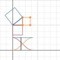
Desmos and the Pythagorean Theorem
I think Desmos is really doing great stuff. I like how clean this graph is and think it could make a great talking point in class.
Saturday, August 17, 2013
Adding Context to Scientific Notation
The world of the small is a great place to introduce scientific notation. This FEI gallery is fantastic and often includes the measurements in the photos: http://flic.kr/ps/DDQp3 I am going to use a bunch of these in my lessons. We could do a daily activity, asking "how many meters is that?"
Friday, August 16, 2013
Pay it Forward
I am a big fan of the movie Pay it Forward. Not only is the film a tearjerker, but I think "paying it forward" could unfold into a great math lesson.
Here is how "paying it forward" works:
1. Do something nice for three people
2. Don't ask them to pay you back, ask them to pay it forward and do something nice for 3 other people.
Students can always read the original story.
Here is how "paying it forward" works:
1. Do something nice for three people
2. Don't ask them to pay you back, ask them to pay it forward and do something nice for 3 other people.
 |
| Trevor explaining Pay it Forward to his class |
I am thinking of questions like "how long would this take to effect everyone on Earth?" Students can interpret the word "long" to represent both iteration and time.
I think its surprising that it would only take 21 iterations to reach the current population. Its also interesting to discuss how 3^20 is not nearly enough, but 3^21 is way more than enough to reach everyone everywhere.
We could go pretty far with our modeling around this problem, but I would my students take the lead. They need to ask questions like:
-can everyone pay it forward? (think babies, deaths, etc)
-not everyone would pay it forward, so how do we deal with that in our model?
I am thinking of starting by showing the trailer:
And at some point I want to show a visual of 3^x. I would use Desmos or Geogebra for the function, but I really want to find other ways to show the idea of exponential growth. This tree has up to 3^5 (or you can view it below).
Students can always read the original story.
Thursday, August 15, 2013
Bike share in math class
The bike share program is new here in New York, but I know its perfect for math class. Not only can we model cost based on time and distance, but New York is sharing all of its data in beautiful interactive charts. I could spend an entire lesson just talking about the story behind each graph. I love that you can toggle through all types of data:

More than that, you can download the raw numbers and play with them on the data software of your choice. The link to the raw data is on the bottom right of the screen:

Boston seems to have set up a competition at visualizing the data behind their bike share program.
With these two examples, I am wondering what else we can find.
More than that, you can download the raw numbers and play with them on the data software of your choice. The link to the raw data is on the bottom right of the screen:
Boston seems to have set up a competition at visualizing the data behind their bike share program.
With these two examples, I am wondering what else we can find.
Shaun and Brian Lehrer
I am a big fan of Brian Lehrer and was excited to get through today on his show on standardized testing and the common core standards. The episode is fascinating, but if you just want to hear my comments, I am on at about 12 minutes and 30 seconds in.
How Much Caffeine is in Your Cup?
I am a coffee snob and am always searching for the perfect cup. I don't often worry about the level of caffeine in my cup (I drink so many cups each day that caffeine no longer has much of an impact), but I came across this article and started to think, "there has got to be a lesson in this."


Since I am teaching 8th grade, I am thinking something with linear models (time vs caffeine based on coffee choices). I also started to wonder, "what is Deathwish coffee?" And "how can I get some?"
1 pound is currently $19. A bit expensive, but perhaps worth it. I like their home page warning:
Not your typical coffee bean:
Disclaimer: This is not your regular morning coffee. This is not your store bought coffee. You will not find this coffee at your local diner or at your sissy 'Starbucks'. Death Wish Coffee is the most highly caffeinated premium dark roast organic coffee in the world. This is Extreme Coffee, not for the weak. Consider yourself Warned
You can find more here: http://www.deathwishcoffee.com/index.html
I haven't designed the lesson yet, but I am wondering how long it would take to consume a lethal amount of caffeine with this brand.
Wednesday, August 14, 2013
Right Triangles and Pro Football
Thanks to Chris Hartman, I saw this article and thought, "there has got to be a lesson in this." I hope to write one soon!
Monday, August 12, 2013
Fabulous Fab
With the SEC finally prosecuting and winning a case against someone behind the financial crisis, we need to ask ourselves "Is this a meaningful victory for the SEC?"
This is something that students might usually debate in humanities, but I think that these types of debates come to life in math class. It is the numbers that really help us make meaning of the trial of Fabulous Fab, Fabrice Tourre. In this video clip, Stephen Colbert brings light on the situation in a way that is guaranteed to get the attention of your class. He points out that the SEC prosecuted someone responsible for 1 billion of the 22 trillion lost in the financial crisis. Then he breaks out a calculator and tries to figure out how much this actually "matters." He stops in the process saying that his calculator can't fit those numbers. My thinking is that this is a perfect opportunity to discuss large numbers on the calculator, scientific notation and the number sense surrounding very large numbers (especially since you don't need a calculator to realize that 1 billion/22 trillion = 1/22000). It might be a great time to discuss the relationship between billions, trillions and other fabulously large numbers.
Here is the clip:
Here is the link to the clip: http://on.cc.com/17z7smc
Saturday, August 10, 2013
A Quadrillion Yen
I just came across this article and thought it might be a great way to discuss large numbers and scale. I might print out the article with some missing numbers and have students fill in the blanks.
Here is a link to the article.
Wednesday, July 31, 2013
So you want to mail a letter? Lets do the math.
Tom Ward posted work on one of Dan Meyer's makeover Monday problems and this got me spending hours researching the history of stamp prices as well as the USPS. I found a bunch of interesting stuff and wanted to share. First, I want to talk about my take on the original problem.
The original problem is a standard fixed growth mindset problem from a Pearson Text:


Instead of giving out stamp handouts or showing one stamp at a time, I might show the timeline here: http://www.priceofstamp.com. It might get students thinking about the general trend in a quick intuitive way. You can watch the timeline animation as a movie below:
Another fun expansion on the postal problem connects to linear equations. The cost of a stamp is based on weight, but the first ounce is often not the same cost as additional ounces. Students could review this wikipedia article and then graph the linear functions that represent costs for mail weights.
I really liked how the post office prices were first based on distance. This just screams for a lesson around a step function.
My favorite find was around the Simpson stamps.

Apparently the post office printed a billion stamps and only sold about 318 million stamps. The Bloomberg article mentions that "the inspector general criticized the process the services uses to decide how many stamps to produce, saying it's unscientific and too much of a judgement call."
The original problem is a standard fixed growth mindset problem from a Pearson Text:
I like Tom's idea of setting this problem up around the concept of a wedding invitation sometime in the future. He posted this awesome invitation:
The lesson develops around the concept of a future wedding and the possible cost of having to mail out invitations.
My opening act 1 would certainly be similar. I am either going to stand by the door with a save the date notice and hand them to students as they enter or dress up as a postal worker and deliver the notices as students work on some type of introduction problem. The idea would be to generate some excitement around the lesson with a clear and fun theme. As a general goal, I try and set the atmosphere of my class to fit the theme of the lesson. So if I go full on wedding theme, there will be appropriate music and decor. If I focus on the theme of the postal service, I will set up the room like a large math mail room (whatever that is, I usually set that up the day before).
For my lesson, I wanted to make my own save the date, but as I am already happily married (and very much in love) to my wife, I needed to pick two people that my students will respond to. So I chose two people that might get married someday (hopefully):
Christopher is my son:
Anna is my friend's daughter:
After a discussion of the stamp problem (and the fact that I am already trying to set my son up with my friend's daughter), the class will naturally start to ask about the cost of the stamps.
I think am going to avoid Pearson's table because it doesn't capture the full spectrum of data around stamp prices. I want students to look at all stamp prices since the USPS started to use stamps. I might simply give them the list from USPS site, but Jo Boaler has me thinking I should give students a chance to see the information from their own perspective.
This might be a bit too much, but I am thinking that students need a moment to see the stamps that correspond to the major shifts in price. They can always use functions, tables and graphs, but I want to give them a moment to make that decision. Here is a handout with all the stamps needed. I grabbed most of the images from this site: http://www.usstampgallery.com
I am thinking I will show stamps in a quick slide show and simply ask, "how do these stamps change?"
Since there are quite a few stamps to look at, I will stop and ask students to share findings as we go and see if they can predict how and why the stamps change in price.
The data on price over the full time span is so much fun, because it goes up and down and up again, increases at steady rates and then makes big leaps. It is the type of data that makes you ask, "what is going on here?"
My act 2 would involve using the stamps to possibly generate a table, graph and/or function to help them find the cost of mailing those wedding invitations in 2038. I pulled some graphs from other sites around this data.
I could show students this form the start and ask them to tell the story of each graph, but I want them to work with the data first.
This one might be a good chart to discuss with the class. I would ask if they think the line should be constantly fluctuating or if it should be like Dan Meyer's step graph.
By including the full spectrum of the data (neither table above is complete), we could also discuss the line of best fit and the concept of an outlier. Students might notice how the price remains low for a very long time and then continues to jump. Hopefully they will debate whether or not we should include those points (which are possible outliers) in our calculations.
Many students might also choose to find the cost of a future stamp by looking at time periods that most closely resemble our own. Perhaps the stamp price growth after the great depression will help us now to predict the cost of a stamp after the great recession.
The data and nature of the problem lends itself to debate and conjecture, which are (thankfully) now a part of the practice standards.
Here are some other thoughts and findings:
Wherever these lessons go, I know I have to talk to the class about the basic process of mailing a letter. I wonder how many of my students have ever mailed or been to a post office? Do they get anything in the mail other than junk mail? I might use this goofy video in the discussion (with some small edits to make it work for the class):
Instead of giving out stamp handouts or showing one stamp at a time, I might show the timeline here: http://www.priceofstamp.com. It might get students thinking about the general trend in a quick intuitive way. You can watch the timeline animation as a movie below:
Another fun expansion on the postal problem connects to linear equations. The cost of a stamp is based on weight, but the first ounce is often not the same cost as additional ounces. Students could review this wikipedia article and then graph the linear functions that represent costs for mail weights.
I really liked how the post office prices were first based on distance. This just screams for a lesson around a step function.
My favorite find was around the Simpson stamps.
Apparently the post office printed a billion stamps and only sold about 318 million stamps. The Bloomberg article mentions that "the inspector general criticized the process the services uses to decide how many stamps to produce, saying it's unscientific and too much of a judgement call."
The question then becomes how many stamps should the post office print? Data around this question can be found in this table from these USPS links. They also post the table below from this link:


I haven't done the math on these numbers, but I like this question. How many stamps should they print each year? This is something that is going to stir up some debate.
After all, I am wondering if there will even still be stamps by the time Chris and Anna (hopefully) get married.
Which the Wall Street Journal might have used:
I haven't done the math on these numbers, but I like this question. How many stamps should they print each year? This is something that is going to stir up some debate.
After all, I am wondering if there will even still be stamps by the time Chris and Anna (hopefully) get married.
Tuesday, July 30, 2013
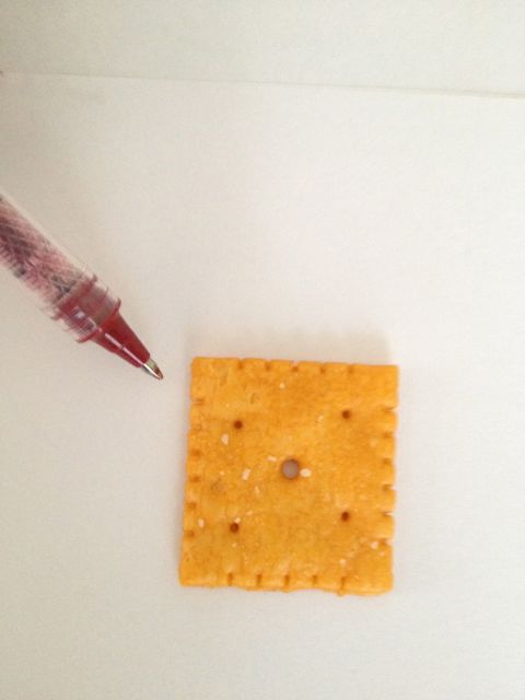
The Big Cheese - A Lesson On Number Sense
I was using Feedly to read Christopher Danielson's Blog and came across his observations around the comparison between regular Cheez-Its and Big Cheez-Its. My sense is that Danielson's observations are perfect for any study in irrational numbers and are also a great opportunity for teaching the growth mindset. I will share some of Danielson's observations and mix in a few of my own. I wanted to share some ideas for how this lesson might work and if I ever assemble the complete lesson, you will find it on http://betterlesson.com (I am working on their Master Teacher Project).
There is so much to gain from this investigation, but the main take away is for students to be aware of the existence and need for irrational numbers, which are a part of these two standards from the common core catalogue:


You can adjust this investigation to reach almost any take away related to number sense and groups and scales and ratios, but I love finding intuitive ways to discover the idea and need for irrational numbers. Students often feel that irrational numbers are just another abstract construct with no purpose or meaning. I think this investigation can show them that irrational numbers are the result of observation of the world we live in.
How would this lesson go? I am not exactly sure (yet). But I started to run through the process as if I were a student. When I plan and create a lesson, I take the time to do the investigation. Not just think about it, but actively go through the process. This helps me catch things I might have otherwise missed. This has become an essential practice for me. I play the role of both teacher and student and try to understand the lesson from both perspectives.
After reading Danielson's post, I went shopping and bought Cheez-Its:

I might have looked a bit crazy, but I purchased enough Cheez-Its to run the lesson in my four classes (with plenty of extra). I bought 4 of the regular Cheez-Its (351 crackers per box):

I bought 5 of the Big Cheez-Its (154 crackers per box):

The mathematical concepts we are aiming for revolve around the claim on the cover of the Big Cheez-It box, claiming that the crackers are "Twice the Size":

I think I would start my lesson with this simple intro. I would tell them about my shopping experience, show the photos and start a conversation around the claim on the box.
"What do you think they mean by Twice the Size?"
I also like Danielson's approach of asking, "did they really mean 4 times as large?" And then proceeding in the lesson by showing that it isn't 4 times as large and then progressing to the tougher question: "how much longer did they make each side?"
In order to help students compare these crackers, I plan on giving my classes the Cheez-Its and possibly a ruler, but I might only offer tools that they request. You don't need a ruler to understand how these crackers are related.
I tried the approach that Danielson's children worked out by comparing the two crackers visually and then with a sketch. I started by putting the two crackers next to each other and thought how I might compare them and articulate why I know the larger cracker isn't four times larger than the smaller cracker:

I think the way I would do this is by tiling four of the smaller crackers and showing that the area of these four smaller crackers is larger that the "Big" cracker. This type of visual proof is perfect because it allows all students to access the problem and is something they could argue to the whole class.
Another approach might be to sketch the crackers (Danielson's son's strategy).
I overlapped the crackers and color coded them (students don't need to overlap them in this way, I was just working through it in a way that made sense to me). Here the regular sized Cheez-It is drawn in green and shaded in. The gap between the Big Cheez-It and the regular sized Cheez-It forms a nice "L" shaped area:

As Danielson suggests, you can cut this space out to compare whats happening. Here I cut out the "L" shape and took a photo on my red table:

If your students do this, be prepared for the "L" shape to be larger than the green square (even though they should be about equal). Here the two white strips are larger than the green square (the regular Cheez-It). You can see a tiny region of green not covered, but this would not hold the overlapping portion of the "L" shape (I wish the photo could have been better):

I was curious about this and started to measure the dimensions of the Cheez-Its. The regular size were relatively square at 2.1cm by 2.1cm:


The Big Cheez-Its were not square. I measured several to be sure. In this Big Cheez-It, length was about 3 cm and the width about 3.3cm


In another Big Cheez-It the length was about 2.8 cm and the width was about 3.2 cm:


As students start to use the rulers, I might ask them why this is happening. Did they make an error in their calculations? Is it a machine error? Is something else going on here?
Students could use a sketch with these measurements, the next progression in problem solving might be to try and make some precise comparisons. I chose to take the average side lengths of the two Big Cheez-Its, but students might take other approaches. I would use these different strategies as a source for conversation in the summary. This could especially lead toward conversations around similarity as well.
Here are my measurements and my sketch (which I might make into a hand out if I decide to not use actual crackers in a lesson):


Here I used the overlapping regions to compare. This shows that the regular Cheez-It is not equal in size to the "L" shape and that the Big Cheez-It is more than twice the area:

This whole process prepares students for the summary. Whatever their approach, they will find that the Big Cheez-It is about twice as large in area as the regular Cheez-It. But the conversation needs to focus on why we aren't getting exact amounts here. The question becomes "How large should the Big Cheez-It be if we want it to be a square cracker that is twice as large?" I might not say "square" since I want students to play with this. They might create other rectangles that have twice the area, but I would say to them, "does that still look like the regular Cheez-It?" I might even make that the challenge from the start (I am still thinking how this lesson will pan out). It could be fun to say, "I want you to redesign the Big-Cheez It. If needs to look like the regular Cheez-It, but actually twice the are of the regular Cheez-It." This would also tap into the process of approximating square roots, another common core standard:

The fun part here is that students are now trying to "fix" the Big Cheez-It. I believe that this process of trying to "fix" the dimensions will help them realize something incredible: there is no rational number that works here.
The discussion at this point would be critical and I am not exactly sure how to structure it, but I know students have to realize that they are looking for a scale factor that makes the over all area twice as large.
I might use other scale factors to help them make some conclusions about what must be happening. They might use the fact that an area four times as large has a scale factor of 2, which is the square root of 4. I might present this and other simple scale factors in a string or list to help them make the connection that (scale factor)^2 = change in area or that the scale factor = (change in area)^(1/2).
I imagine that students will come up with two possible changes for the Big Cheez-It. They might suggest multiplying each side by the square root of 2 or multiplying each side by a decimal approximation close to the square root of 2.
My question will be "what is the connection between the decimal that some people found and the idea of the square root of 2?" This would lead them into the next lesson where we define this relationship and the concept of irrational numbers.
Danielson points out a few other wonderful avenues to explore with the crackers. Since the scale factor for each side is about the square root of 2, we can line up the crackers to show decimal approximations for the square root of 2. Just be aware that the orientation of the larger crackers matter, since they are not squares. If you line up the Big Crackers by their shorter dimension, then you get the 7:5 approximation of the square root of 2:

If you line them up the long way, you will not get the 7:5 ratio that approximates the square root of 2:

In this case students can line up the crackers to get the 3:2 ratio, which is the first rational approximation of the square root of 2:

I think these cracker comparisons are at the heart of understanding the irrational number. I would love to challenge students to find how many crackers it would take to get them to perfectly line up.
The idea of irrational numbers will show in the way that the crackers never seem to line up perfectly. Of course, this is the idea of an irrational number: there is no rational fraction to represent the ratio between the side lengths of the regular and Big Cheez-Its. Even those these crackers will line up perfectly at some point, they are a nice way to represent the idea of an irrational number. I might design the whole lesson around this component. I am still not sure.
Danielson also discusses the mass of each Cheez-It. Here is my image from the boxes I bought:

This approach might work nicely in the lesson as well, since 14 of the Big Cheez-Its = 30 grams and 27 of the regular Cheez-Its = 30 grams. I didn't confirm this with a scale, but if I were to analyze the mass, I would probably have my students use a scale.
There are so many ways to approach this lesson and I am still not sure how I will develop it, but I am glad Danielson posted this connection. I am wondering what other foods we could use?
Monday, July 29, 2013
The Value of a Mistake, EDUC115N: How to Learn Math
A major component of Jo Boaler's course covers the psychological connection between the growth mindset and the importance of mistakes in learning. The basic argument is that the growth mindset helps students use mistakes as opportunities. I am grateful that Boaler has brought my focus onto this basic, fundamental and crucial point.
Once she began to present this argument, I basically smacked myself in the forehead (literally) and said, "of course!" Of course a student needs to know and understand that a mistake is an opportunity to grow. I realized that a part of me has always assumed students do this. But they don't. Boaler has convinced me that many students still have the fixed mindset.
Fortunately, Boaler's main goals is to help us think and teach about the growth mindset. She discussed the reactions of a child to their school day:


On Tracking:
Once she began to present this argument, I basically smacked myself in the forehead (literally) and said, "of course!" Of course a student needs to know and understand that a mistake is an opportunity to grow. I realized that a part of me has always assumed students do this. But they don't. Boaler has convinced me that many students still have the fixed mindset.
Fortunately, Boaler's main goals is to help us think and teach about the growth mindset. She discussed the reactions of a child to their school day:
"Math is too much answer time and not enough learning time."
When we rush kids, we encourage the fixed mindset. But it is essential to give them time on the content and intuition of any math problem you present. Here are the basic growth mindset elements she shared:
These elements are major components to every successful lesson I have ever given. Boaler starts with "openness", which leads to opportunities for "different ways to seeing" an answer. This by definition encourages students to find "multiple entry points" to the problem. With different paths to choose in their strategies, students will have opportunities for rich conversation in the lesson and opportunities to give "feedback." Its a collaborative and intuitive model. It is also simple in structure and thus portable and useable for other teachers.
Boaler gives a significant amount of research and references to show the importance of feedback. This ties into the philosophy of different mindsets and has some surprising results. These studies have already really made me think about the role of assessment and feedback in my classroom.
In one study, students were given three different types of assessment:
In the first group, students received grades from the traditional summative assessment model. This was my high school experience. You work and get a grade for your efforts.
The second group was simply given diagnostic feedback. Diagnostic feedback is like the standards based grading model without any grades. Instead, they offer simple one sentence feedback, like "you worked really hard to get that concept. I wonder if you would like to go a bit further?"
The third group was given both the traditional and standards based grading model (something that I work with, posts coming eventually).
The surprising result is that the students who received no grades at all (the diagnostic model) outperformed the others.
The idea is that the diagnostic model helps students identify what they need to know. As Boaler states, "But they found that the very best thing you can do for students is to ditch the grade and give them diagnostic feedback. And that feedback helps them understand how they can improve."
Many students struggle because they are not sure of what they already know and where they are going next. Helping students recognize their progress and see the next steps is paramount.
Diagnostic feedback can look a lot like standards based grading and my sense is that the line between the two is certainly blurred. Boaler gives an example of a learning goal or standard:
I like the idea of working the standard into a statement that students can actually say. It gives merit to their work when they read the standard, something more than just "measures of central tendency" and an actually statement that they can recite out loud or to themselves, "yes, I do understand the different between mean and median and know when they should be used."
Another study built upon the diagnostic feedback idea and split students into a group with class discussion (traditional chalk and talk teaching) and a group that utilized peer and self assessment (variations of themes in standards based grading).
The amazing result here is that all students at all levels improved in the group that focused on peer and self assessment, especially the lowest achievers. They responded so well that they started to exhibit the learning behaviors of the highest achievers. This goes back to the simple idea that you can only be successful if you are aware of what you currently understand and what you need to understand next.
The last major study that Boaler mentioned compared the work of students who are tracked, or separated by their grades and students who are mixed together, regardless of their achievement levels. I am a strong opponent of tracking and am excited to see studies that back up my thinking around this matter.
Here were the major points of the study:
The logic for these results is quite simple. Students who are placed or tracked into a section are essentially forced into the fixed mindset, thinking that they are either "good" or "bad" at math. The teachers also perceive the students in this way and give them work and lessons accordingly. This combination essentially prohibits students from understanding the growth mindset, a necessary ingredient for success in math. In stark contrast, the teacher in the mixed class must challenge all students and help all students succeed. In doing so, the lessons and work in a mixed classroom can help all students reach their full potential.
I look forward to the remaining sessions!
Here are the three studies I referenced, in order:
Diagnostic Feedback:
Butler, R. (1988). Enhancing and Undermining Intrinsic Motivation: The Effects of Task-Involving and Ego-Involving Evaluation on Interest and Performance. British Journal of Educational Psychology, 58, 1-14.
Discussion Group vs. Peer and Self Assessment:
White, B., & Frederiksen, J. (1998). Inquiry, modeling and metacognition: making science accessible to all students. Cognition and Instruction, 16(1), 3-118.
On Tracking:
Here is the study reference:
Burris, C.C., J.P. Heubert and H.M. Levin (2006), "Accelerating Mathematics Achievement Using Heterogeneous Grouping", American Educational Research Journal, Vol. 43, No. 1, pp. 105-136.
Public Space and EDUC115N: How to Learn Math
I just finished sessions 3 and 4 of Jo Boaler's course, EDUC115N: How to Learn Math and wanted to share some of my main take aways.
The course eloquently phrases the necessary components of great teaching. There is a wonderful moment in a session where you watch Cathy Humphreys' work around establishing a growth mindset in her class. Boaler outlines Cathy's basic tenants of this class culture:

The course eloquently phrases the necessary components of great teaching. There is a wonderful moment in a session where you watch Cathy Humphreys' work around establishing a growth mindset in her class. Boaler outlines Cathy's basic tenants of this class culture:
This class culture of "sense making" is built upon chances to represent work, collaborate with others, value successes and mistakes and what she calls "public space." This is a phrase that I am going to start using. "Public space" is quite literal and represents the time in class where students can share and discuss their ideas with the "public." I think giving this teaching move a name and sharing that name with the students can be very valuable. I find that naming and identifying routines helps students make meaning of the class process.
Subscribe to:
Posts (Atom)